Critical CSS: What It Is and How to Implement It
Critical CSS inlines above-the-fold styles to eliminate render-blocking CSS. Learn how to extract critical CSS with automated tools and integrate it into your build pipeline.
- css
- performance
- critical css
- core web vitals
- render blocking
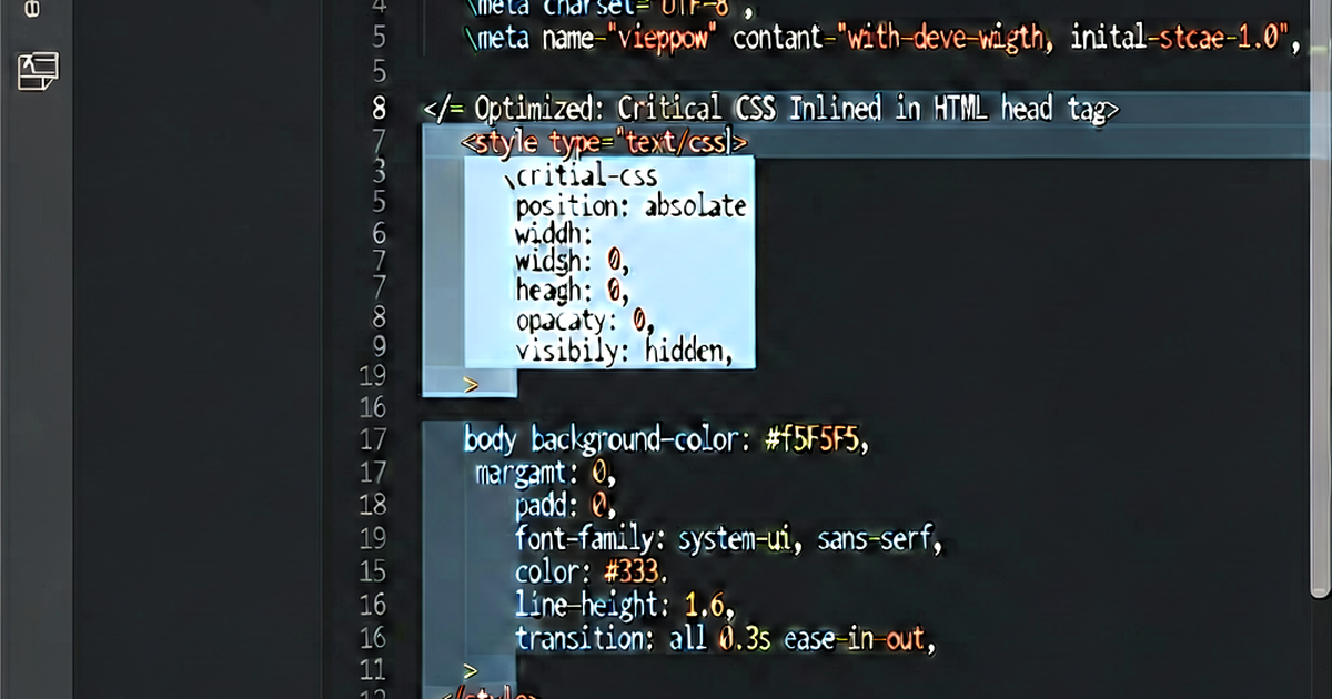

Critical CSS is the minimum set of styles needed to render the visible portion of a page — the “above the fold” content. Inlining these styles in <head> eliminates render-blocking CSS requests and improves First Contentful Paint (FCP) and Largest Contentful Paint (LCP).
Why CSS blocks rendering
When the browser parses <link rel="stylesheet" href="styles.css">, it stops rendering until the stylesheet is fully downloaded and parsed. On a slow connection, this adds hundreds of milliseconds to the time before the user sees anything.
Normal rendering path:
HTML parse → Download CSS → Parse CSS → Layout → Paint
                   ↑
              Render blocked here
With critical CSS:
HTML parse → Parse inlined CSS → Layout → Paint (visible content)
           → Download remaining CSS (async, below fold)
The user sees content immediately; the rest of the stylesheet loads in the background.
What “critical” means
Critical CSS is the styles needed for:
- Layout of the viewport-visible area
- Fonts used in above-the-fold text
- Colors and backgrounds visible on first render
- Navigation bar styles
- Hero image sizing and positioning
Non-critical CSS includes: styles for modals, dropdowns, footer, below-the-fold sections, hover states, animations that don’t affect initial layout.
Extracting critical CSS automatically
criticalcss / critical
npm install --save-dev criticalconst critical = require('critical');
critical.generate({
src: 'https://example.com', // or local file path
target: {
html: 'dist/index.html', // output HTML with inline critical CSS
css: 'dist/non-critical.css', // remaining CSS
},
width: 1300,
height: 900,
inline: true, // inline into HTML
});The critical package renders the page at the specified viewport size in headless Chrome and extracts styles that affect visible elements.
Multiple viewport sizes
Above-the-fold content differs by device. Specify multiple dimensions:
critical.generate({
  src: 'index.html',
  dimensions: [
    { width: 375, height: 667 },   // mobile
    { width: 768, height: 1024 },  // tablet
    { width: 1300, height: 900 },  // desktop
  ],
  inline: true,
});
Critical CSS merges the styles needed for all viewports.
Loading remaining CSS asynchronously
After inlining critical CSS, load the full stylesheet without blocking:
<!-- Async CSS loading — recommended pattern -->
<link rel="preload" href="/styles.css" as="style" onload="this.onload=null;this.rel='stylesheet'">
<noscript><link rel="stylesheet" href="/styles.css"></noscript>
The rel="preload" starts downloading immediately but doesn’t block rendering. onload switches it to a stylesheet once downloaded. The <noscript> fallback handles no-JS environments.
A simpler approach with media:
<link rel="stylesheet" href="/styles.css" media="print" onload="this.media='all'">The browser downloads print stylesheets but doesn’t block rendering on them. The onload switches the media to all, applying the styles without a re-render.
Build pipeline integration
webpack with critical
npm install --save-dev html-critical-webpack-plugin// webpack.config.js
const HtmlWebpackPlugin = require('html-webpack-plugin');
const HtmlCriticalPlugin = require('html-critical-webpack-plugin');
module.exports = {
mode: 'production',
plugins: [
new HtmlWebpackPlugin({ template: 'src/index.html' }),
new HtmlCriticalPlugin({
base: path.join(path.resolve(__dirname), 'dist/'),
src: 'index.html',
dest: 'index.html',
inline: true,
minify: true,
width: 1300,
height: 900,
}),
],
};Vite with vite-plugin-critical
npm install --save-dev vite-plugin-critical// vite.config.js
import { defineConfig } from 'vite';
import { critical } from 'vite-plugin-critical';
export default defineConfig({
plugins: [
critical({
criticalUrl: 'http://localhost:4173',
criticalBase: './dist',
criticalPages: [{ uri: '/', template: 'index' }],
criticalConfig: { width: 1300, height: 900 },
}),
],
});Measuring the impact
Use Chrome DevTools Lighthouse or web.dev/measure to capture FCP and LCP before and after:
- Run Lighthouse on your page without critical CSS
- Note FCP and LCP values
- Implement critical CSS
- Run Lighthouse again
On a typical site, critical CSS reduces FCP by 200–800ms on slower connections. The improvement is most visible on 3G or throttled connections.
Common pitfalls
Too much critical CSS: If the critical CSS block is large (> 50 KB gzipped), the inline approach adds more to the HTML than it saves in round-trips. Keep critical CSS focused.
Missing font declarations: If above-the-fold text uses a custom font, include the @font-face declarations and font-display property in the critical CSS.
Dynamic content: Pages that render differently for logged-in users may need per-template critical CSS extraction.
Cache invalidation: Inline critical CSS can’t be cached separately. It’s included in the HTML document, so any CSS change invalidates the HTML cache.
After extracting: minify the critical CSS
Critical CSS tools often produce readable CSS. Minify the inlined block for maximum benefit:
critical.generate({
  src: 'index.html',
  inline: true,
  minify: true,   // minify the inlined block
});
Or paste your critical CSS into cssminify.io for quick compression.

Related reading
-
CSS Optimization Techniques: A Practical Guide
A practical guide to CSS performance: minification, critical CSS, unused CSS removal, efficient selectors, custom properties, and modern techniques for faster rendering.
-
CSS File Too Large? How to Diagnose and Fix It
Debug an oversized CSS bundle: find unused styles with Chrome Coverage, identify bloated selectors, tree-shake framework CSS, and measure the real impact.
-
How to Remove Unused CSS: PurgeCSS, UnCSS, and Tree-Shaking
Remove unused CSS from your stylesheets using PurgeCSS, Tailwind's built-in purging, UnCSS, and webpack tree-shaking. Reduce CSS file size by up to 95%.